 When I was at an art fair this year, I picked up a functional graffiti stool (see picture) made out of cardboard. Over 400 lbs can be placed on it, I use it as a foot stool. I believe graffiti is an art form, though in the past it was considered vandalism. Now, building owners hire graffiti artists to do artistic graffiti on their buildings. Even galleries carry artwork by graffiti artists. There is still some graffiti that is unwanted, especially if gang related. But the creativity and use of color by graffiti artists cannot be denied. Enjoy!
Monday, September 30, 2013
Functional Graffiti
 When I was at an art fair this year, I picked up a functional graffiti stool (see picture) made out of cardboard. Over 400 lbs can be placed on it, I use it as a foot stool. I believe graffiti is an art form, though in the past it was considered vandalism. Now, building owners hire graffiti artists to do artistic graffiti on their buildings. Even galleries carry artwork by graffiti artists. There is still some graffiti that is unwanted, especially if gang related. But the creativity and use of color by graffiti artists cannot be denied. Enjoy!
Saturday, September 28, 2013
Venus of Willendorf
 |
| Venus of Willendorf, 24,000 to 22,000 BC |
Friday, September 27, 2013
Artist Trading Cards
 |
| Alice Cook, Artist trading cards |
Thursday, September 26, 2013
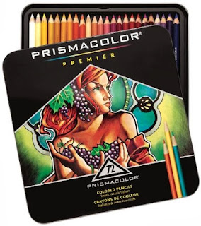
Prismacolor Colored Pencils
 Around a month ago I picked up a 72 count of Prismacolor Colored Pencils. I have done a few pictures with them, and am currently using them in my Drawing 2 class. I like the softness of the pencil, which gives intense and rich color depending on the pressure you use. I like to work on paper that has a medium tooth for creating layering with the colored pencil. The only con is that it is a bit sensitive to sharpening due to the soft tip, it has broken on me a few times. Otherwise I would say that if you are interested in using them for a professional grade artwork it is worth the price, which is steep. Enjoy!
Wednesday, September 25, 2013
In the Studio
 I was in my studio the other day doing some cleaning and organizing and I ran across a sketch pad and a book called, A Guide To The Elements. My love of science made me stop and check it out. To my surprise in the sketch pad were drawings of the elements in graphite. Then I remembered that I began a study in drawing the elements as pictures and putting there atomic number on top and atomic weight on the bottom. This picture was a study on the element Cadmium. Here I decided to draw my paint tube of Cadmium Red, since it contained the element. This was a fun discovery, in which I am going to continue with drawing the elements. Enjoy!
Tuesday, September 24, 2013
Tradition In Art
 |
| J.M.W. Turner |
Monday, September 23, 2013
Piet Mondrian and Composition
 |
| Piet Mondrian, 1921 |
Saturday, September 21, 2013
Tree In Pastel
 |
| Alice Cook, Tree Number One, 2013 |
Friday, September 20, 2013
Drawing 2, Week 3
 |
| Alice Cook |
Thursday, September 19, 2013
Why Master Your Technique?
 |
| Ingres, 1862 |
Wednesday, September 18, 2013
Screen Printing Kit
Recently I received as a gift a Speedball Screen Printing Kit. Since in the past I have done some print making, such as drypoint and linocut relief, I was aware of screen printing. Though I am glad to have received the gift, I really know nothing about the process, so here enters Wikipedia. According to Wikipedia, "Screen printing is also a stencil method of print making in which a design is imposed on a screen of polyester or other fine mesh, with blank areas coated with an impermeable substance. Ink is forced into the mesh openings by the fill blade or squeegee and on to the printing surface during the squeegee stroke." I an excited to work in this print making technique and will be posting future artworks from this technique. Enjoy!
Tuesday, September 17, 2013
Robert Smithson and Process
 |
| Robert Smithson, Spiral Jetty |
Monday, September 16, 2013
Drawing 2, Week 2
 |
| Alice Cook |
Saturday, September 14, 2013
Mark Rothko and Seeing
 |
| Mark Rothko, 1952 |
Friday, September 13, 2013
Design 2
 |
| Alice Cook |
Thursday, September 12, 2013
Learning to Draw?
 |
| Rembrandt |
Wednesday, September 11, 2013
Marcel Duchamp
 |
| Marcel Duchamp, Fountain, 1917 |
Tuesday, September 10, 2013
New Acrylic Painting With Collage
 |
| Alice Cook, Outside of Time #2 |
Monday, September 9, 2013
101 Things to Learn in Art School
 A couple of months ago I picked up this book called, 101 Things to Learn in Art School, by Kit White. Since I am a fine art major, I thought it would be interesting to get another person's point of view on art school. The book gives "lessons, demonstrations, definitions and tips on what to expect in art school, what it means to make art, and how to think like an artist." I've read through the book once and will be going through it again, but more methodically and giving my own insights. Enjoy!
Saturday, September 7, 2013
Shout Out to Robert Motherwell
 |
| Rober Motherwell, Elegy to the Spanish Republic, 108, 1965 - 1967 |
Friday, September 6, 2013
Landscape in Oil
 |
Thursday, September 5, 2013
No Room For Arrogance
 |
| Andy Mack |
Wednesday, September 4, 2013
Stress and the Arts
According to Eric Maisel, "many demands must simply be met if we are to reduce our stress...If we don't get it done, the stress will remain with all sorts of new stress piled on top of it. Actually meeting demands reduces stress." Procrastination is one of my worst enemies in art. An artwork may be challenging, anxiety increases and then I push it off for some other time. This "pushing off for some other time" only increases the stress and anxiety and, at times, I turn to TV or food to relieve it. I have found that the best thing is to just show up in my studio and "just do it." Sounds easy, but it really is an internal war that I fight on a frequent basis. Be encouraged. Enjoy!
Tuesday, September 3, 2013
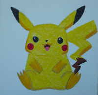
Pokemon and Art
 Is Pokemon's Pikachu art (see picture)? Are any figures from Pokemon art? Then we have to ask, what is art? According to the dictionary art is "the expression or application of human creative skill and imagination, typically in a visual form such as painting or sculpture, producing works to be appreciated primarily for their beauty or emotional power." But then we ask, what is beauty? Beauty is in the eye of the beholder. So the Pokemon are certainly art, they require creative skill and imagination, they are done in some medium (digital or not), and to some they are beautiful. Enjoy!
Monday, September 2, 2013
Abstract Last Supper
 |
| Alice Cook, Last Supper |
Subscribe to:
Comments (Atom)
